What a Flyer Needs to Actually Get Noticed
What should a flyer look like to get results? Here's what makes a flyer work — layout, color, copy, and the design choices that improve response rates.
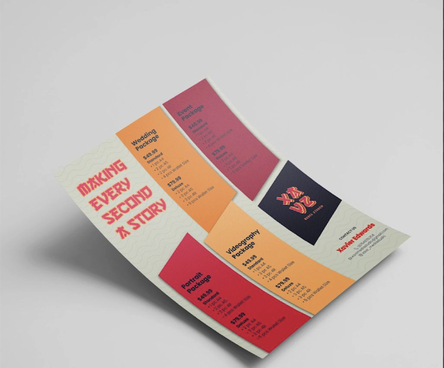
Most flyers fail for one of three reasons: too much text, a weak headline, or the wrong paper. Get those three right and you’re already ahead of most people handing out flyers in your area.
That might sound obvious. But getting all three right at once — in the space of a single sheet of paper — takes more thought than people expect. Here’s what actually matters.
The Headline Is the Only Thing That Matters First
When someone picks up your flyer, they decide in about two seconds whether to keep reading or move on. That’s the window you’ve got.
A headline that just shows your logo and business name wastes that window. The reader doesn’t know you yet. They need a reason to care. Lead with the benefit, not the brand. “Save 20% This Weekend Only” works. “Proudly Serving the Community Since 2005” doesn’t. “Free Estimate, Same Week” gives someone a reason to hold onto the flyer.
Make it specific. Make it about them. One clear offer or benefit, as few words as possible. The rest of the design exists to support that one line.
Layout Choices That Make People Stop
Once the headline earns a second look, the layout needs to keep things moving. A few things that consistently work:
One focal point. If three things are competing for attention, nothing wins. Pick one hero element — the offer, the image, or the headline — and build around it. Everything else is secondary.
Contrast over color. Your flyer doesn’t need five colors to stand out. It needs enough contrast between text and background that someone can read it from a few feet away. Dark text on light, or vice versa — commit to one and stick to it.
Leave some breathing room. Negative space isn’t wasted space. Cramming every inch with text and images makes the whole thing harder to read. White space is what guides the eye.
If you’d rather not build from a blank canvas, a good cheap flyer template already has these basics built in.
Choosing the Right Paper for Your Design
Paper choice affects how your flyer reads — literally. A glossy finish makes photos and colors look sharper, which is why it’s common for event flyers, restaurant promotions, and anything image-heavy. A matte finish cuts glare and makes text easier to read, which fits service listings, community notices, and text-focused designs better.
Neither finish is wrong. But the wrong choice for your design type can make an otherwise good flyer feel off. A photo-heavy layout on flat, uncoated stock can look dull. A dense, text-heavy design on high-gloss can be hard to read under overhead lighting.
Not sure which paper finish to choose? That depends on what you’re promoting and where the flyers will actually be displayed.
What to Include and What to Cut
Most flyers try to say too much. Here’s what actually needs to be on there:
A headline that states the benefit. One or two short sentences of supporting copy — enough to explain the offer but not a wall of text. A clear call to action: not “contact us” but “call before Friday for 10% off” or “scan this to book your spot.” Your contact info — phone, website, or QR code. Your logo, kept small.
Cut the paragraph of company history. Cut the long list of every service you offer. Cut anything that belongs on your website instead. The flyer’s one job is to get someone to take the next step.
Once the design is solid, affordable flyer printing makes sure the final product looks as good in hand as it does on screen. Good paper and solid printing make a real difference in how people respond to what you’ve created.